AI for AI (artificial insemination) — Deep Topological Analysis for sensor data
Find out how TDA and Deep Learning classifies events and discovers hidden patterns in IoT activity sensors’ data streams
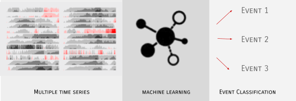
Suppose you have multiple sensor data streams, and you want to be able to classify events. It could be using sensors on an aircraft engine to detect suboptimal patterns or medical diagnostics to detect a disease.
- Position (compass data in three directions)
- Velocity (gyroscope in three directions)
- Acceleration (accelerometer in three directions)
This type of data is impossible to analyse using popular Business Intelligence tools such as PowerBI or Tableau. Such systems will not be able to capture complex patterns in the data and will not allow you to explore them.
However, this is a good situation for Deep Topological Analysis (DTA) and visual understanding of complex patterns. DTA is an example of unsupervised machine learning, meaning you don’t need to label your data prior to analysis. The output is a clustering of behaviour which is faithful to the underlying data but is intuitive to the subject matter expert. This more refined method allows you to discover what you don’t know that you don’t know.
First, a human example
A mobile phone is a typical source of movement data: position, velocity and acceleration in the x, y, z planes.
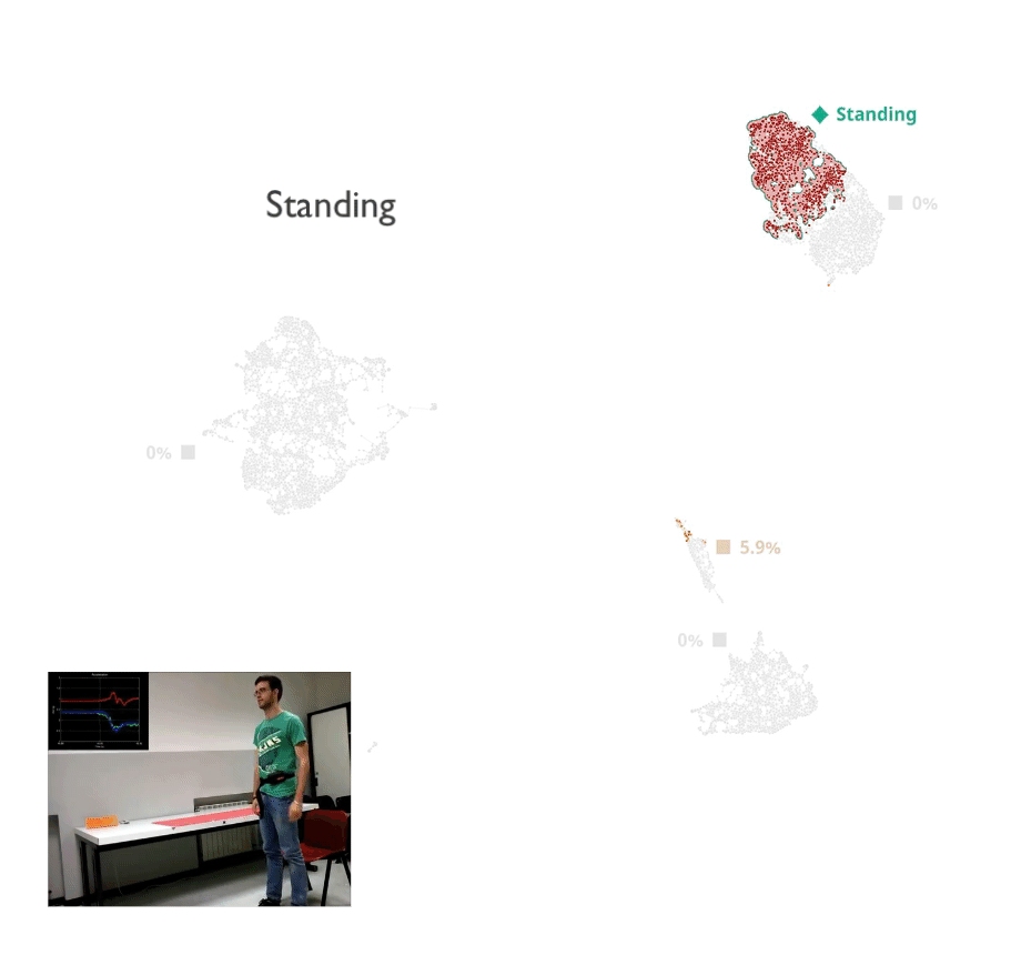
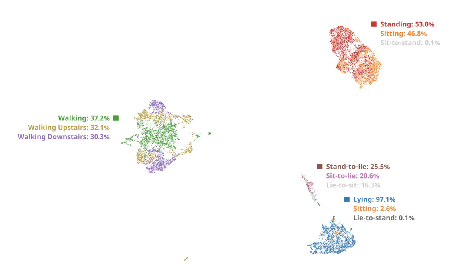
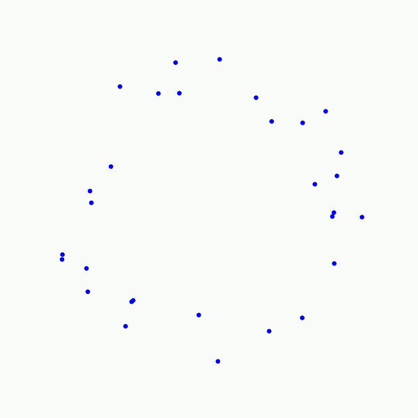
Running DTA on this data allows you to see how the algorithm works (see picture). Each dot is a short window in time, and the closer together two dots are, the more similar the behaviour occurring in that window. Natural clusters of behaviour emerge from the algorithm, and these clusters can easily be identified by the subject matter expert (in this case, we’re all familiar with moving around a house).
The broad clusters — standing, sitting and lying down are immediately apparent. But zooming into the visual shows much more interesting sub-structure, such as walking upstairs, walking downstairs and other types of interesting behaviour. This type of visual gives a broad distribution of clusters which makes sense to those that know the area, and in many cases, the sub structure augments understanding of the subject matter expert.
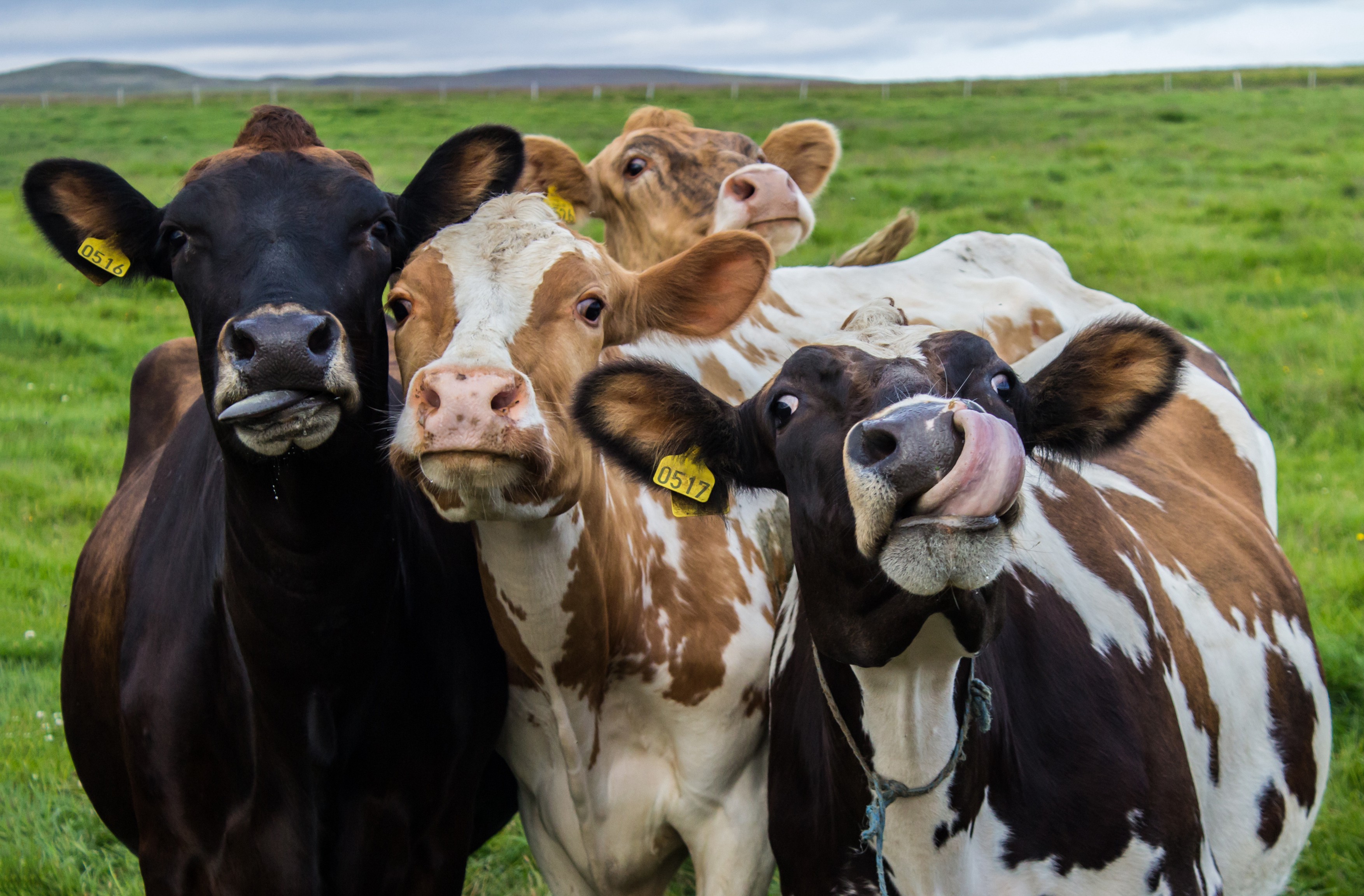
AI for a limping cow
A good farmer knows his cows, and can tell when they come into heat. But doing it remotely with a low cost collar is a multi-million dollar data science challenge. Each collar has a set of sensors installed that capture data 24/7 and send a snapshot of metrics every minute. Each sensor is generating 9 data streams:
- Position (compass data in three directions)
- Velocity (gyroscope in three directions)
- Acceleration (accelerometer in three directions)
So there’s lots of data to analyse per cow, and we could be talking about thousands of cows.
A simple way to solve this problem would be to measure distance walked — cows cover a lot more distance when in heat. However, a more refined analysis involves inferring events and behaviours of said cow. This results in a much more complete picture of what the cows are doing and what state they are in. Importantly, this type of analysis allows you to discover activity that you didn’t previously know about, such as limping or disease.
When data gets large, standard approaches quickly end up missing detail or failing altogether. Some approaches that don’t work are:
- Principal Component Analysis (PCA) — very fast, but often not applicable for human analysis as prone to generate blobs
- Multidimensional scaling (MDS) — fails to identify structure, too slow and memory hungry for large data volumes
- T-SNE — has some successes but often misses detail, or finds too much details and leads to fake clusters which misrepresent the actual structure of the data
- UMAP — is a good recent algorithm, which performs better than t-SNE, although it doesn’t have enough learning power as deep learning to capture complex high-level patterns from the data
Data from cow sensors was processed using discussed algorithms. All algorithms were executed with default meta-parameters.
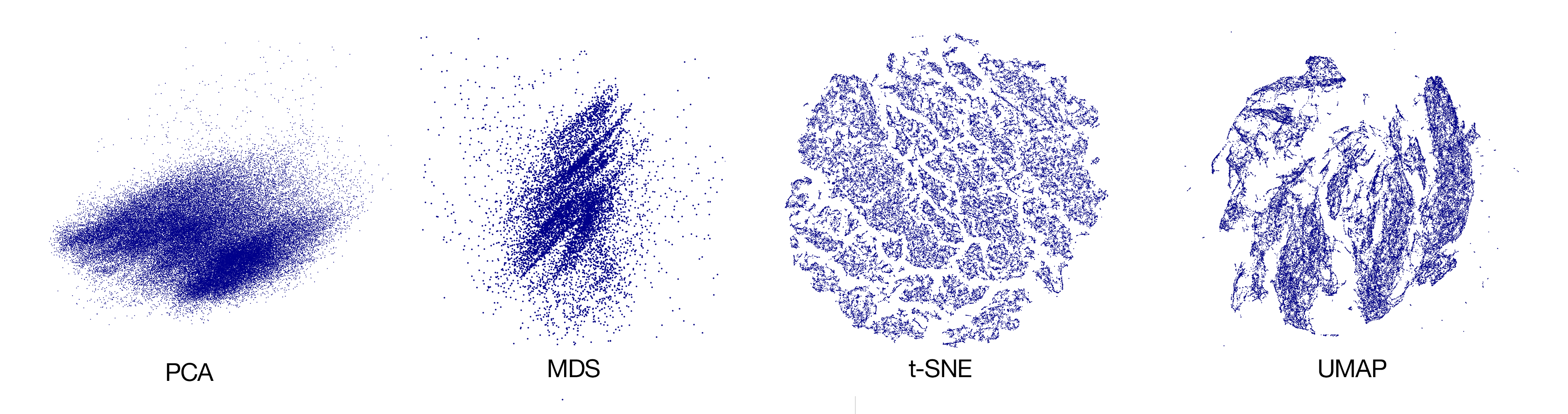
As you can see, PCA and MDS fail to capture any structure from the data. t-SNE on the other side seems captures too much structure, most of which does not exist in the data. UMAP shows promising results, although the clusters are not as distinguished as DTA and the structure is somewhat blurry. Here the DTA result:
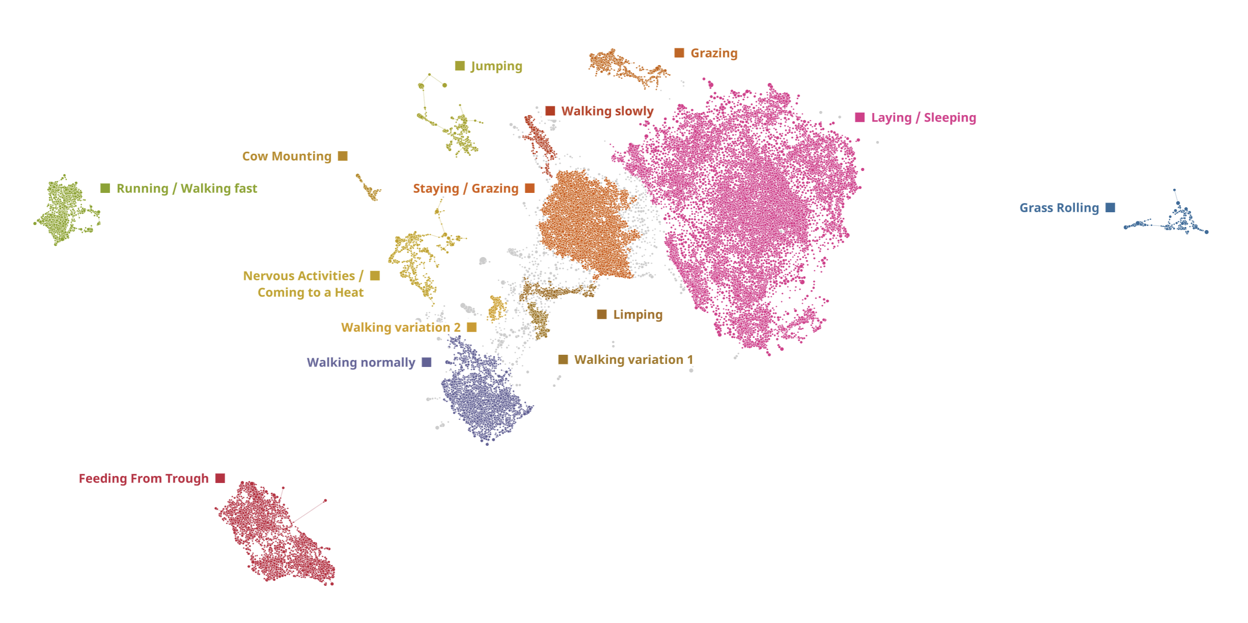
Every dot on this graph represents a 10 minutes window of every cow activity in the dataset. Dots placed together form clusters of unique activities.
By contrast, DTA maintains a lot of fine grained structure. We have evolved this approach over time and it’s our preferred method of dealing with clustering problems.
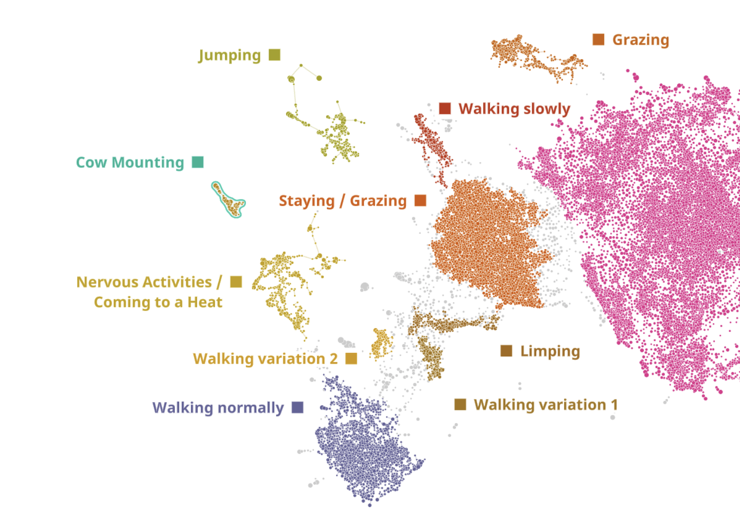
Having analysed cow sensor data at DataRefiner using DTA algorithms in a completely unsupervised way, we got a map of cow activity during several non-continues episodes. The total period was about 2000 minutes for each cow (or 83 hours); there are 43 cows on the map. Each dot represents a window of 10 minutes cow activity (sliding by minute). Separate clusters represent unique types of activity, — the further the clusters are from each other, the more different the activities are. We performed an extensive verification of the activity patterns and can confirm the segmentation is accurate.
As you can see, the cows spend the majority of their time lying and grazing/feeding but there are some other activities as well such as jumping or grass rolling.
This is how the cows are distributed across the activities:
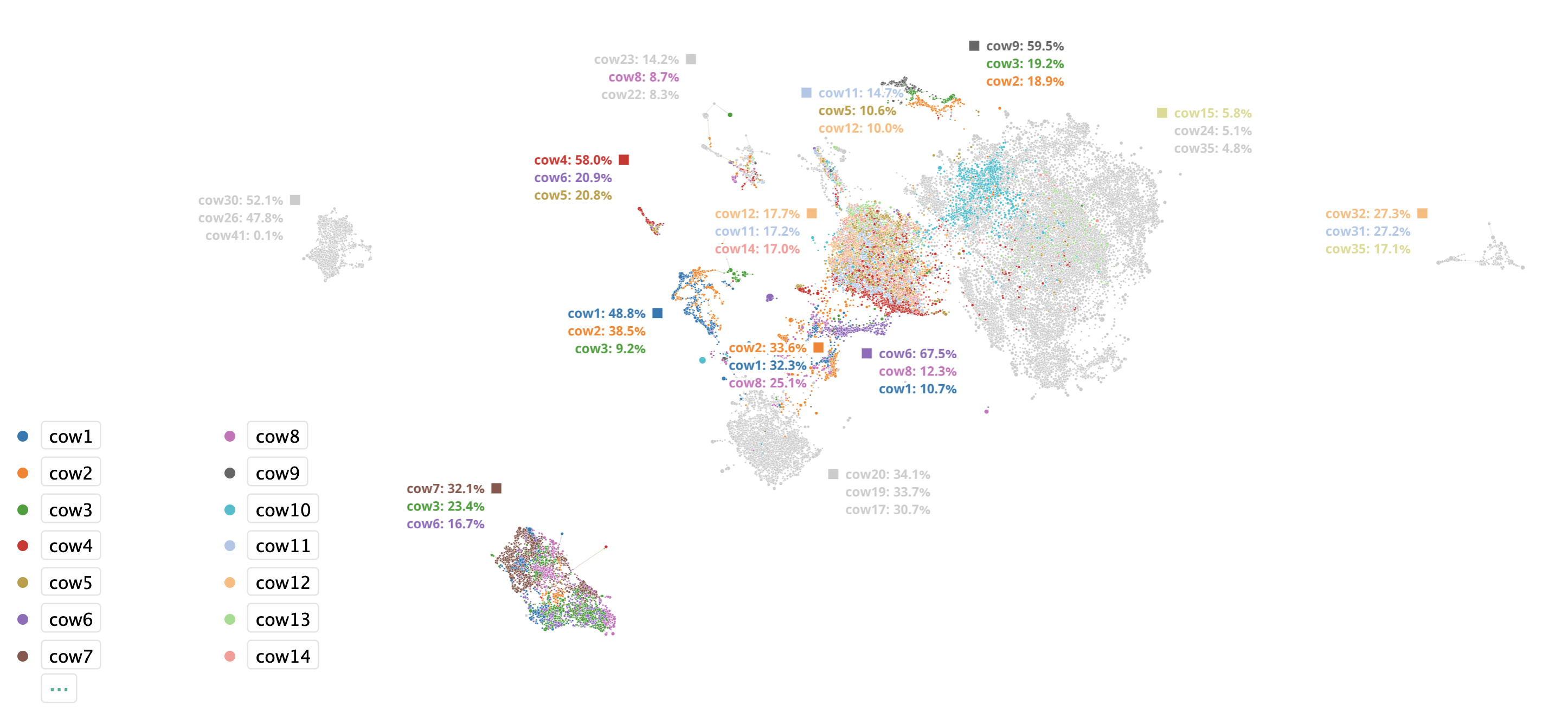
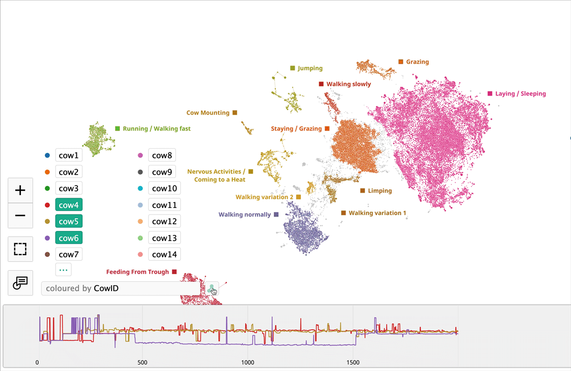
We’ve coloured the map points according to the CowID (first 14 cows) leaving the rest grey for readability. Cows are not evenly distributed across activities and it seems each has her own preferences. By selecting a particular cow we can explore what the cow did and in which activity patterns she participated.
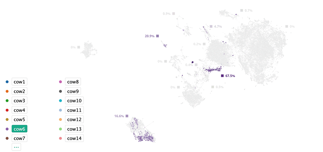
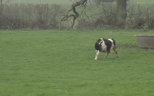
Cow6 had unusual activity patterns — she spent time between feeding from trough and an activity very close to walking. This is a separate cluster with a unique pattern, so after some review we found out that Cow6 was limping. She couldn’t cover long distance so her behaviour would not be normally classified as coming to a heat. However, we can see she was also active in the ‘Cow Mounting’ cluster (see pic) as they come to a heat. This way we know that we’ve got a limping cow that has come to a heat — a very refined result that might otherwise have been missed. Now it’s time for a different type of AI: artificial insemination.
Deep Topological Analysis
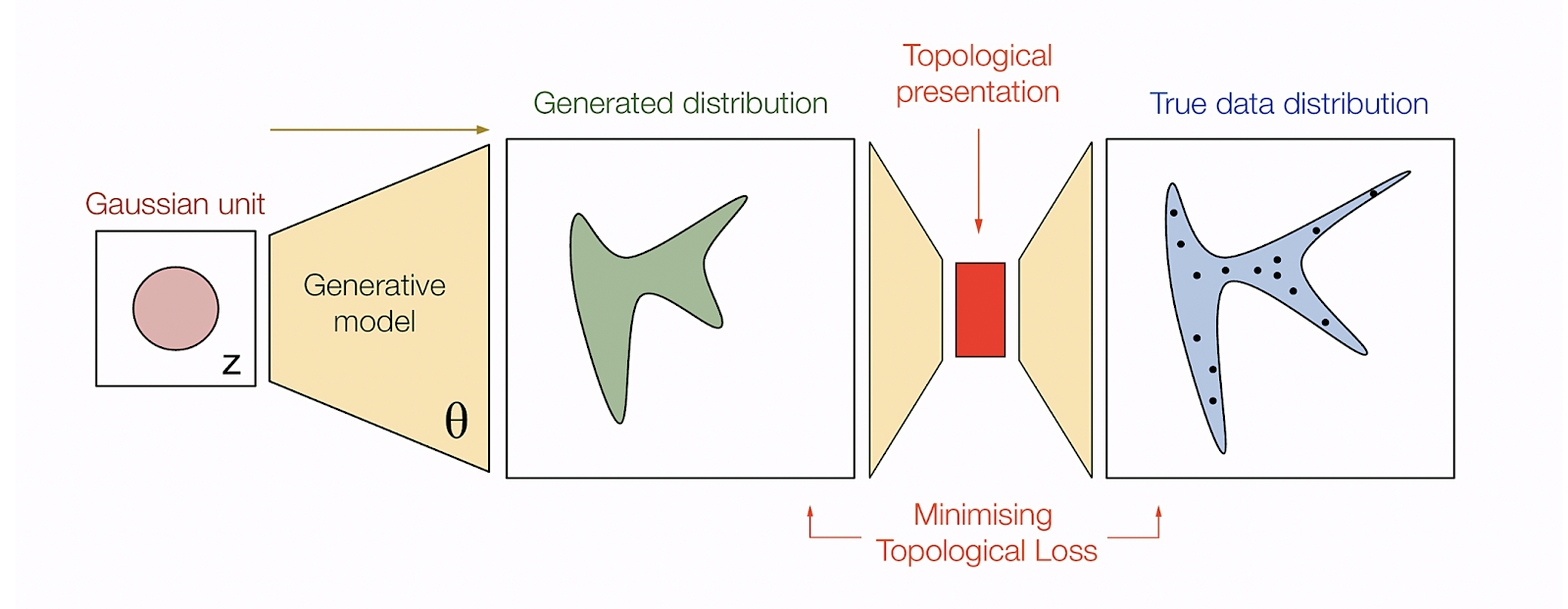
Deep Topological Analysis (DTA) is a combination of Topological Data Analysis (TDA) and Deep Generative models.
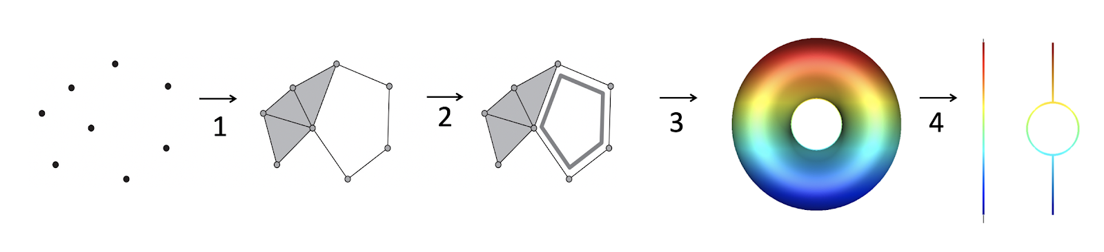
The aim of the computation process is to get as close representation of multidimensional structure on 2D or 3D planes. General DTA process is the following:
1 Take cloud of points in original dimensionality and compute nested topological complexes. In this case we’ll be using Vietoris-Rips algorithm. This is a process of connecting nearby points into topological structures.
2 Using nested complexes compute topological persistence of this structure. Using created complexes from the previous step we can compute barcodes of the structure. These barcodes will help us to identify persistent elements of the structure.
3 Create data structure manifold using Morse theory. This step helps us to simplify the manifolds in original dimensions and allows us to transform the result for user to analyse.
4 Extract Reeb graphs from multidimensional structure. Calculate 2D and 3D representations using results from Reeb Graph and Morse theory.
Steps 3 and 4 are very computationally expensive, especially for large volumes of data with large dimensionality. To make these steps feasible for real-life applications we have to perform approximation and estimations.
Here, instead of doing a simple approximation we use generative models to get not just a simple approximation, but also learn complex patterns from the data. This helps to get better clusterisation and pattern separation.
Conclusion
At DataRefiner we’ve been using this technology in a number of companies not just for IoT analysis but also for user activity and text segmentation. Get in touch if you’d like to learn more or book a demo.
****
DataRefiner.com is a UK based company that specialises in analysis and segmentation of complex data like user activity, sensor or texts. The DataRefiner platform is the result of many years refining approaches discussed here, but is applied across a wide variety of industries, including aviation, social networks, fraud detection and more. For more information regarding your industry, contact us on ed@datarefiner.com
References:
[1] Smartphone-Based Recognition of Human Activities and Postural Transitions, https://sites.google.com/view/smartlabunige
[2] NADIS. National Animal Disease Information Service. Cows in heat: https://www.nadis.org.uk/disease-a-z/cattle/fertility-in-dairy-herds/part-2-heat-detection/
[3] Vietoris-Rips algorithm animation: https://towardsdatascience.com/the-shape-that-survives-the-noise-f0a2a89018c6
[4] Topological Data Analysis — Persistent Homology: http://outlace.com/TDApart1.html
[5] Mathijs Wintraecken: https://www-sop.inria.fr/members/Mathijs.Wintraecken/Mathematica.html
[6] Teng Ma; Zhuangzhi Wu; Pei Luo; Lu Feng. Reeb graph computation through spectral clustering, 2011
[7] Original OpenAI GAN diagram: https://openai.com/blog/generative-models/